
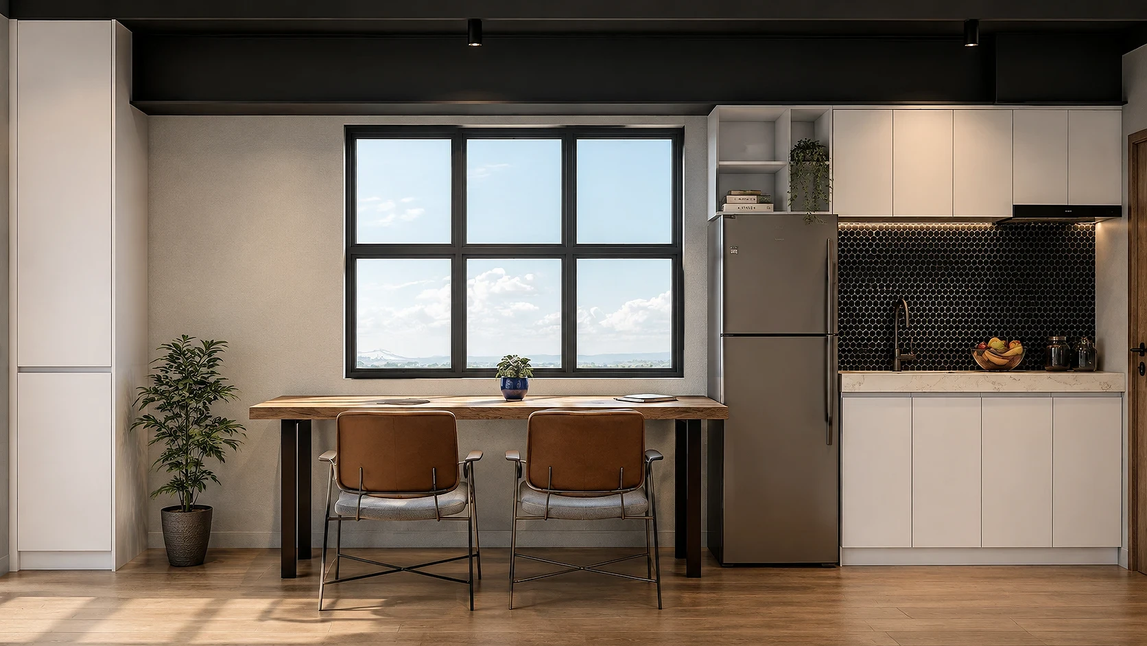
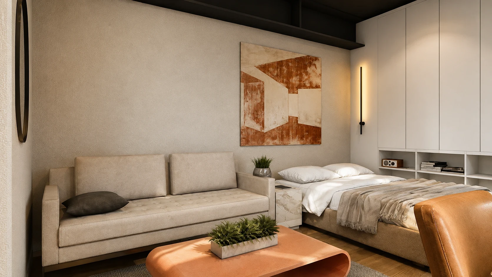
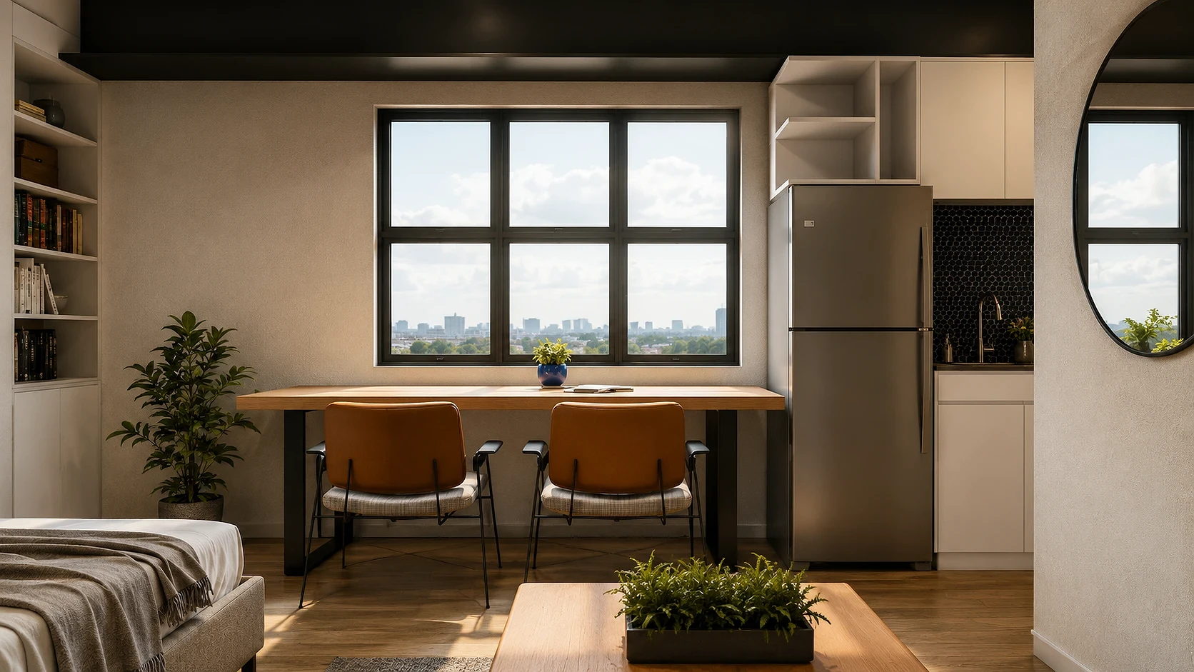
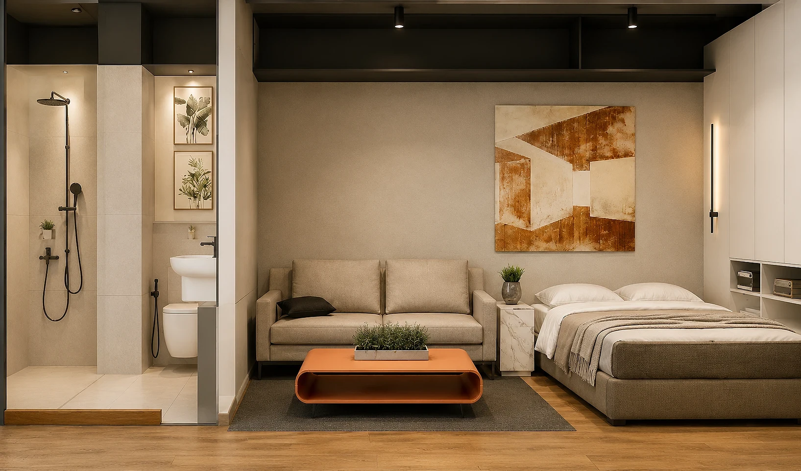
A 22 sqm studio unit interior for a mixed-use residential tower on Boni Avenue, Mandaluyong. ABcubed Architects paired warm wood tones with black steel beams and space-smart built-ins.
01. Project Details
Boni Avenue Typical Unit, Front & Rear Studio Interiors
Typical residential studio unit interior
22.5
Boni Avenue, Mandaluyong City
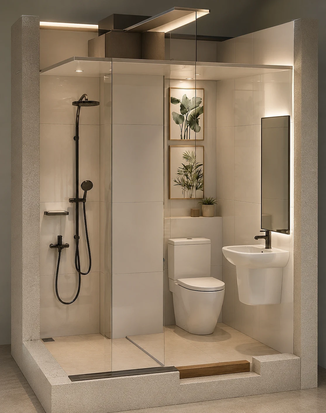
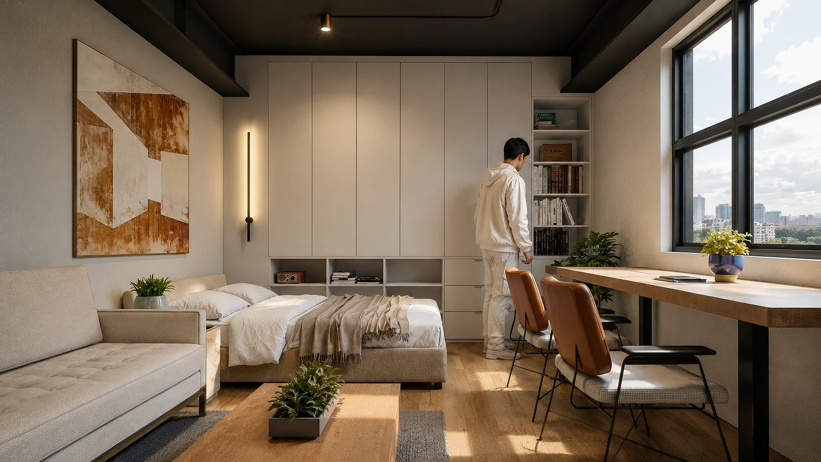
Frameless glass shower enclosure with teak threshold step; wall-hung water closet and lavatory fixtures; wide window above the dining counter for daylight and skyline views; black-painted exposed beam ceiling as a design feature
02. Project Discovery Brief
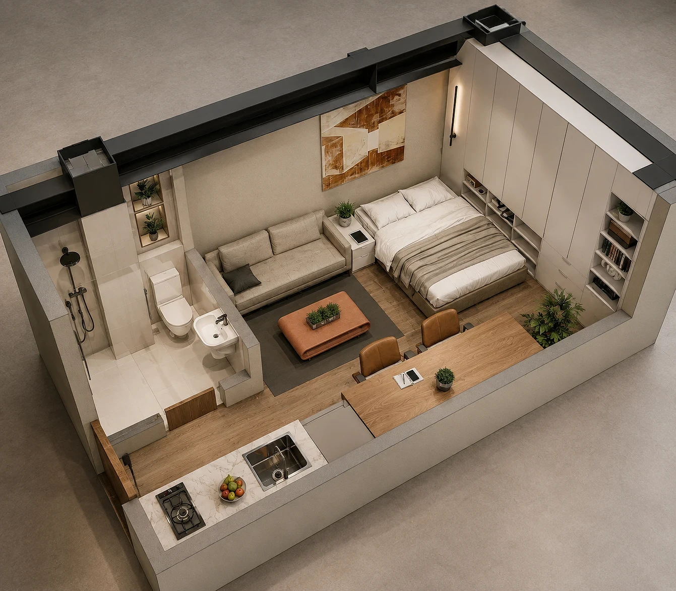
The brief for this unit was simple to state and hard to solve: give the future resident of a compact studio, on either the front or rear side of a 12-storey mixed-use building on Boni Avenue, a home that actually feels like one. Not a hotel room stacked twenty-two square meters deep, but a place where someone can wake up, make coffee, sit down to a proper meal, and unwind at the end of the day, all inside a footprint of roughly 6.3 by 3.5 meters. ABcubed Architects, shaped a unit that layers sleeping, dining, cooking, and washing into one continuous plan, from the black-painted structural beams left exposed overhead to the wide window that pulls daylight across the dining counter each morning.
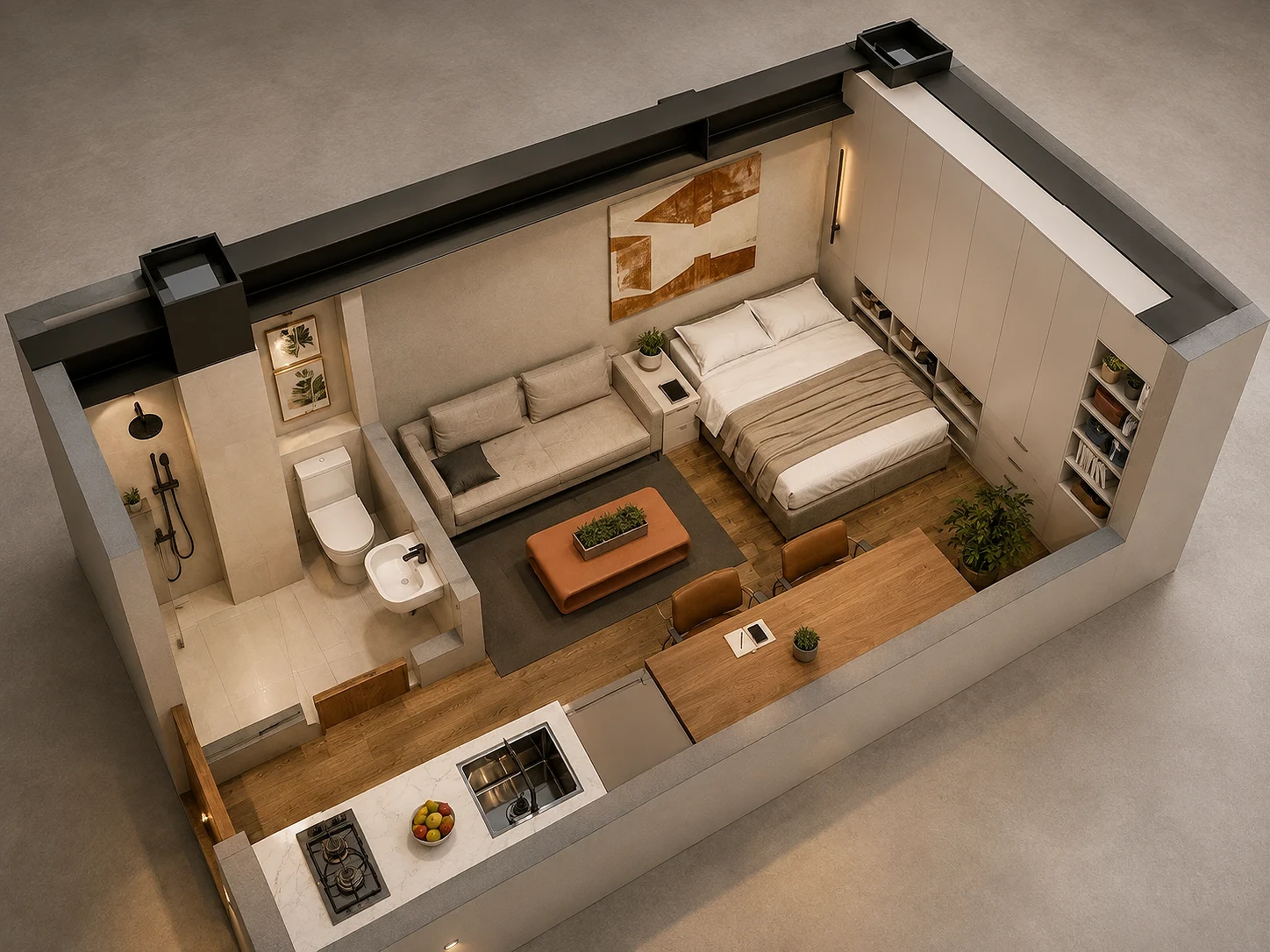
Because the unit type had to repeat, front-facing and rear-facing, across multiple floors of the building, the brief was really two briefs at once: design a single studio that feels considered and personal, and make sure that design could be built consistently, unit after unit, without losing its character. The program packed into that footprint included a full-size bed with integrated storage, a three-seat sofa and coffee table, a two-top dining table by the window, a compact kitchen run with sink, cooktop, and refrigerator, and an ensuite toilet and bath with a separate glass-enclosed shower. Every centimeter had to earn its place.
03. Concept & Vision
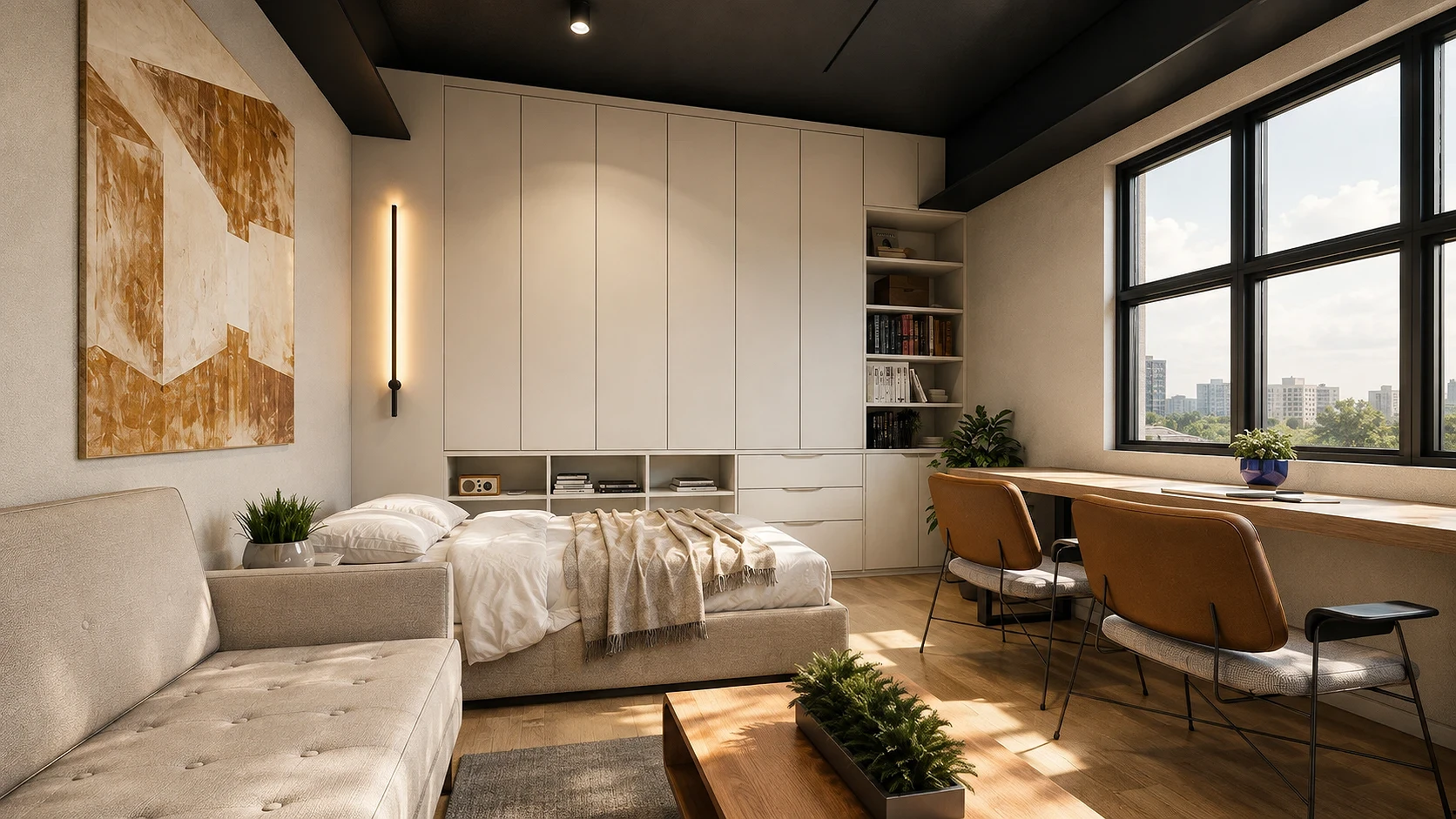
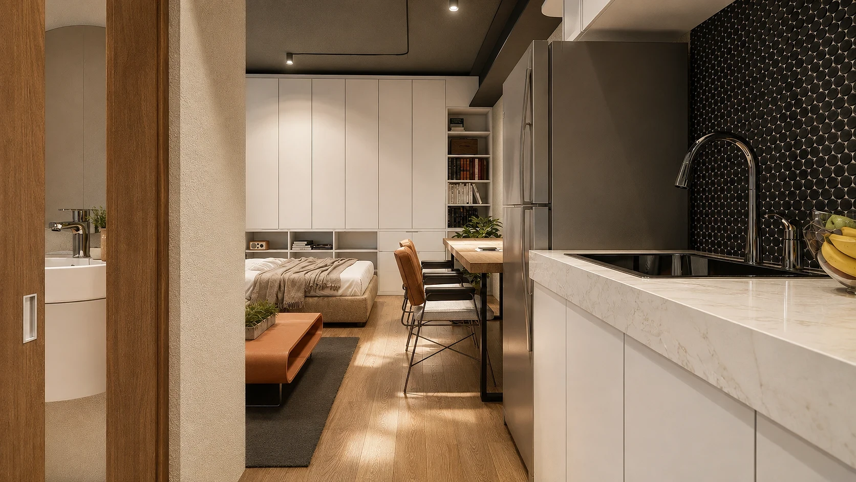
The concept treats the unit as a single loop rather than a set of separate rooms. Entering past the kitchen, the plan opens along one continuous run: dining table, sofa and coffee table, then the bed against the far wall beneath a full-height wardrobe. Nothing is boxed off except the toilet and bath, which sits just off the entry behind a frosted glass door. The structural beam overhead, painted black in an intumescent fireproof coating, is left visible rather than boxed in with a dropped ceiling, turning a code requirement into a loft-like datum line that runs the length of the unit and quietly signals where the kitchen ends and the living zone begins.
The vision was calm efficiency: a studio that reads as generous even though it measures barely over twenty square meters. Warm wood-tone flooring runs underfoot through the sleeping and living zone, softened by a charcoal area rug and a burnt-orange leather coffee table, the one saturated color note in an otherwise quiet palette of white cabinetry and warm timber. Against the black ceiling beam and matching wall sconce, the effect leans industrial-loft rather than cramped studio, a home a resident would choose to stay in on a Sunday, not just sleep in on a weeknight.
04. Design Development
Every material decision in this unit was tested against two questions: does it hold up to daily use in a small footprint, and does it read as considered rather than cost-cut. The wood-tone glazed tile in the living and sleep zone gives the main living area warmth underfoot and visual continuity from the entry to the bed wall, while the wet zone switches to a 60x60 white non-skid ceramic tile for safety in the toilet and bath, a practical break that also reads cleanly as a material change marking the transition into that room. Cabinetry throughout is specified in a white duco finish, keeping visual weight low against the darker floor and beam so the compact plan doesn't feel boxed in.
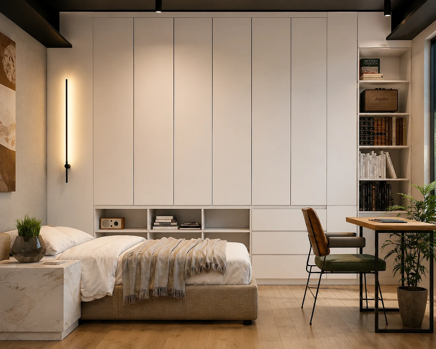
The kitchen run carries the unit's one bold material move: a penny round tile backsplash against a white granite-tile counter, paired with a stainless-steel gooseneck faucet and single-bowl sink. That backsplash does real work in a unit this size, it gives the eye a place to land in an otherwise quiet material palette without adding another piece of furniture to a tight footprint. Storage was solved the same way: rather than a freestanding closet eating into floor area, the design runs a full-height wardrobe wall behind the bed, with a lower bank of open shelving doubling as bedside storage and display space for books, a radio, and personal objects, so the headboard wall does double duty as the unit's primary storage.
The toilet and bath was planned as its own compact isometric study, a frameless glass shower enclosure with a wall-hung water closet and lavatory, stainless-finish fixtures specified throughout, and a teak wood threshold step marking the shower's edge against the tile floor. Fireproofing the exposed beam was non-negotiable given the beam runs structurally exposed rather than hidden above a ceiling, so the black intumescent coating was chosen specifically because it could double as a finish rather than requiring a separate cosmetic layer over a fire-rated one.
05. Construction & Delivery
Because this unit type needed to repeat front-to-rear across the building's upper floors, ABcubed Architects delivered it as a fully documented template rather than a one-off interior: a 1:25 blow-up plan, four interior elevations, and isometric views of both the main living space and the toilet and bath, each carrying a full finish schedule down to tile format, fixture type, switch and outlet series, and paint finish. That level of documentation meant the same warmth and material logic could be built consistently whether a given unit landed on the front or rear side of a floor, without each contractor reinterpreting the design from scratch.
The moisture-resistant gypsum ceiling, painted flat white, was specified specifically for the toilet and bath zone to hold up against daily steam and humidity, while the rest of the unit's ceiling stays open to the black-painted beam. Whichever floor a resident's unit ends up on, front-facing toward the avenue or rear-facing toward the building's interior, they arrive to the same considered materials, the same daylight strategy at the dining window, and the same sense that twenty-two square meters can still feel like a real home.
06. Involvement
ABcubed Architects carried this unit type from architectural planning through interior specification. The firm's scope covered the unit's spatial layout and blow-up plan, all four interior elevations, isometric perspectives of the living space and the toilet and bath, and a complete finish and fixture schedule covering flooring, wall and ceiling treatments, cabinetry, custom millwork for the wardrobe wall and kitchen run, lighting, plumbing fixtures, and hardware, down to the specific tile format and fixture type. Rather than handing off a single drawing set, the firm built a repeatable design package the developer could construct unit after unit with the same material integrity throughout the tower.
This typical studio unit is one piece of ABcubed Architects' broader interior design practice, shaping efficient, materially considered homes for the residential towers it designs throughout Metro Manila.